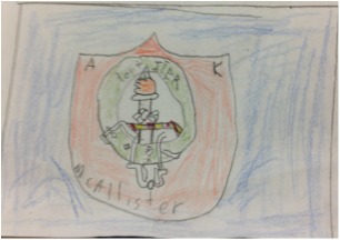
The designing of the logo went okay. Most people just did something simple but i wanted to do something more deep then that. In the logo everything in it represents something about me. The color red if you look it up it stands for energy and it is also my favorite color and blue stands for loyalty. Loyalty with energy meaning that I am really loyal and stick to one side. The shield represents protection and I am protective over my belongings and family. The A, K, and McAllister stand for my first, middle, and last name, and last but not the least is my family family crest in the center which stands for my interest in my family's history. Little did I know what i had in-store for me. But if i had to one thing that made me the maddest about this project it is the blog.