In the beginning of this project we had someone come and teach us about graffiti art and how it is not bad and she aught us about the tagging that goes along with it. Tagging is when you are with a group of artists are with each other to make art and you put just one name in the corner of the page or you all have one theme. So my group when I was gone decided to draw the same theme of UNICORNS. ON Monday I had to catch up with my group And they decided to do the design at the top and bottom with the word unicorn on top of that. I decided to write the original on top of that so it read the original unicorn then I drew a triceratops's head and colored it and after that the period was over and i thought it was pretty good.
For this project I had to make something that could be presentable, and it had to compare artwork from different countries and the person's background. I choose Europe (the scream), Japanese (The Great Wave off Kanagawa), and last I did American art ( American Gothic). I did research on each one and how they came up with the idea or why they drew and what some of it means. I would have done more but I ran out of time.
In class we were told to make a keynote of a certain topic of our choosing. Many people choose a certain artist but I decided to do their last known art. After that putting it in a keynote we had to put it in to something else besides a keynote. I tried putting into a couple other things but I didn't know enough about them. I ultimately just decided to put it into a pages document.
The challenge yourself is do something that challenged you and that you might fail at. I decided that I wanted to draw something that was bigger then the regular paper. So I got a big piece of poster paper. Then decided to draw a pony. After drawing the pony I had to color it. Coloring it was by far the most time consuming thing about it and took several class periods. When done coloring I cut just the head and hair and put a tree and sun in the back ground.
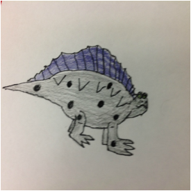
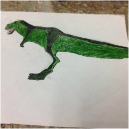
When doing this project I felt like we did't have enough time to as much as I wanted to do. There was also several other challenges that would have taken even longer for me to be able to do those I would have had to stayed after school or come during extension. I wasn't gonna do that unless I had to, but for the project I chose it was hard for me to come up with something to draw but I decided to draw dinosaurs. I decided to draw dinosaurs because I cared about fossil fuels and how they are running out and what we are going to do when they final do. First when doing this project I looked at pictures of dinosaurs and decided to draw a t-Rex so I drew a t-Rex based on the image, but I changed a couple of things like his head, the little arms, his feet and his tail. When I was done drawing the t-Rex I still had a couple of days left so I stated the process over again looking for another dinosaur. Eventually I found the spinosaurus that looked easy to draw on a copyright free website. So I tried drawing that. I think I did a bad job, but I didn't have enough time to fix it. I took the t-Rex and cut it out and pasted it down on the paper with the spinosaurus.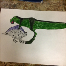 During the logo design Mrs. Meyer would tell what to do in reverse so you barely know what to do when getting started and she doesn't give you any tips like don't put so much detail in it because it would be to hard and take to long. I made this cool looking logo and she came up to me and said that has to much detail so I had to come up with a new logo but since I don't have any ideas at all when i am supposed to I didn't get anything done that day either and I was already one day late and now I am two days late. The first day was because Mrs. Meyer decides that it would be a great idea to use the sharp objects for the first project but before you can use sharp objects you have to get a piece of paper signed by your parents saying yes I will be good and no I will cut people. So when I came back the next day I had to trace it in reverse on the back side of the sheet. Then I had to a shade in the general spots where the logo was. Because this helps with something. Then you have to trace the reverse design on to this little clay board. Then you finally get into the carving, The carving was also really bad. Even though I already got ride of a lot of content on the logo it still had to much and was really hard to carve. There was even a easier way to do the carving part since I wanted the logo part and the background to be two different colors instead of carving the background I should have carved the out the logo, but Mrs. Meyer told me to carve out the background so that is what I did. There probably is a problem with carving out just the logo instead of the background but I just don't know it. The funny part of all this is usually she is really good at explaining things. But if i had to one thing that made me the maddest about this project it is the blog.
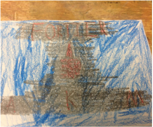
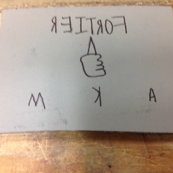
The designing of the logo went okay. Most people just did something simple but i wanted to do something more deep then that. In the logo everything in it represents something about me. The color red if you look it up it stands for energy and it is also my favorite color and blue stands for loyalty. Loyalty with energy meaning that I am really loyal and stick to one side. The shield represents protection and I am protective over my belongings and family. The A, K, and McAllister stand for my first, middle, and last name, and last but not the least is my family family crest in the center which stands for my interest in my family's history. Little did I know what i had in-store for me. But if i had to one thing that made me the maddest about this project it is the blog. 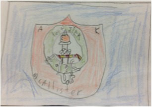 | ArchivesApril 2023 
| ||||||