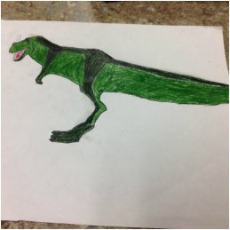
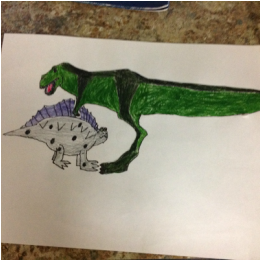
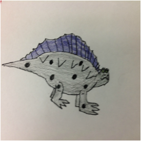
During the logo design Mrs. Meyer would tell what to do in reverse so you barely know what to do when getting started and she doesn't give you any tips like don't put so much detail in it because it would be to hard and take to long. I made this cool looking logo and she came up to me and said that has to much detail so I had to come up with a new logo but since I don't have any ideas at all when i am supposed to I didn't get anything done that day either and I was already one day late and now I am two days late. The first day was because Mrs. Meyer decides that it would be a great idea to use the sharp objects for the first project but before you can use sharp objects you have to get a piece of paper signed by your parents saying yes I will be good and no I will cut people. So when I came back the next day I had to trace it in reverse on the back side of the sheet. Then I had to a shade in the general spots where the logo was. Because this helps with something. Then you have to trace the reverse design on to this little clay board. Then you finally get into the carving, The carving was also really bad. Even though I already got ride of a lot of content on the logo it still had to much and was really hard to carve. There was even a easier way to do the carving part since I wanted the logo part and the background to be two different colors instead of carving the background I should have carved the out the logo, but Mrs. Meyer told me to carve out the background so that is what I did. There probably is a problem with carving out just the logo instead of the background but I just don't know it. The funny part of all this is usually she is really good at explaining things. But if i had to one thing that made me the maddest about this project it is the blog.
The designing of the logo went okay. Most people just did something simple but i wanted to do something more deep then that. In the logo everything in it represents something about me. The color red if you look it up it stands for energy and it is also my favorite color and blue stands for loyalty. Loyalty with energy meaning that I am really loyal and stick to one side. The shield represents protection and I am protective over my belongings and family. The A, K, and McAllister stand for my first, middle, and last name, and last but not the least is my family family crest in the center which stands for my interest in my family's history. Little did I know what i had in-store for me. But if i had to one thing that made me the maddest about this project it is the blog.
|